When you select any existing App and version or start a new app design in Evoke the first thing you need to do is set up the look and feel of the app that you are designing and building.
-
The colour palettes that you will use within your design
-
The font styles and sizes
-
Screen background images and logos
-
Cultural styles of different devices
-
Menu style
-
and more that you save to be your App's Theme...

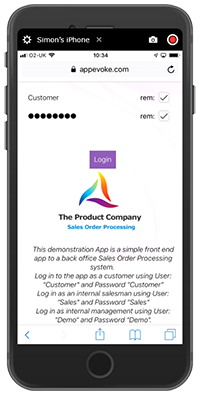
This is where the login page that will be used by the app is defined. If you have created a new app design then a default login page will have been created for you and the details of this filled in here. You can also specify if a login button, other than the default button, is to be used on the login page and if a specific authentication selection is to be run instead of the default Login Authentication.
You can select if you would like to take the user to a specific Page Series after they login or request that they make a selection from the menu.
App Styling
-
App Colors
The App Colours styling section includes:
-
A Standard Colour palette, allowing you to set the colours of a base colours palette for your app.
-
A Custom Colour palette, allowing you to set additional colours for use in your app.
-
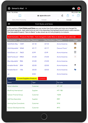
The ability to redefine fonts, font sizes, bold, italic, etc., by device/operating system, from the default fonts and settings used in this Theme so that these can be used, where desired, within your app design.
-
The ability to redefine some of the reserved regions in your App e.g. the menu area, data grid, headers, text, loading progress bar, etc to default to using colours in your colour paletes.
-
-
Background
-
General Styling
Set the general styling to be applied to the entire app:
-
Cultural overrides - Different device operating systems (i.e. iOS, Android, etc) offer their own specific styles for items such as menus, headers, etc. these are know as device "Cultures". Where possible Evoke Apps will, as default, use these "Cultures" in Evoke apps. Some organizations wish to provide apps with a common "corporate" Culture so that the app will look exactly the same regardless of the device that it is viewed/used on. The check boxes within the "Cultural styling overrides" section will, when checked, force the Culture styles on these different devices to all adopt the Culture style that is set for Windows desktop apps.
-
Default page margins - options to set the top, bottom, left and right margins of an app. These settings will set the distance, in pixels, from the edge of the screen, that the app will be displayed.
-
Font Override settings - the default font style and font size can be reset for the app to be different for each device type that the app will run on.
-
-
Menu Styling
-
Menu Default Style - Pick the default style of menu that app users will see when starting up the app on a desktop computer screen or when clicking the "hamburger" style menu on a mobile device (can be changed by individual users when running the app to their personal preference). Options are a) Normal (the menu name, including icon image if present, in a list format) b) Tiled (the menu name, including icon image if present, in a traditional tile format) c) Minimal (just the menu icon image, without the menu name in words, in a narrow band until the user clicks the "peek" option in the running app which will then temporarily show the "normal" menu d) Unpinned (hidden) the menu is hidden and can be accessed via the "hamburger" icon in exactly the same way as it appears on a mobile device.
-
Add a help button in your App menu that will allow your App users to access App specific user help (that you are able to set up). Choose 'in app' help screens or access an external URL for context sensitive help web pages.
-
Display a Logo or corporate message that will appear, near to the bottom, on the menu bar of your App.
-
Main Menu Text - This text box allows the entry of a new legend to replace "Main Menu" at the top of the App menu.
-
Customise the other images and styles of you app menu.
-
Default Data Segment Settings
Set up your own default data segment colour settings redefining any of the default (base) segment settings, used when you work on your app design, i.e. the background/Border, Header background, Header Text, Body text (data and prompts), Buttons, Grid Header and Grid Header Background, etc to use any of the colours you have set up in your colour palettes. You can also set spacing around your app to new default levels.
-
Style Themes
Save your settings to an app theme that you can use for your current app, other app designs or to change in the future and save as a further theme. Multiple pre-set themes are included for use, if desired, within Evoke.

Global Data Areas
When a new app design is created the Global DataSource of "CurrentUser" is added to give the App developer access to the user record of the 'logged in user' throughout the App Design. This Global DataSource is populated with the AppUser record at the time of login in the deployed running app.
App User Security and Navigation (User Groups)


-
Have access to your App design
-
Access specific versions of your App design
If you wish to use the Evoke Multi developer functions you must designate specific users to have access to the app design and all or a subset of these to have access to each specific version.
